
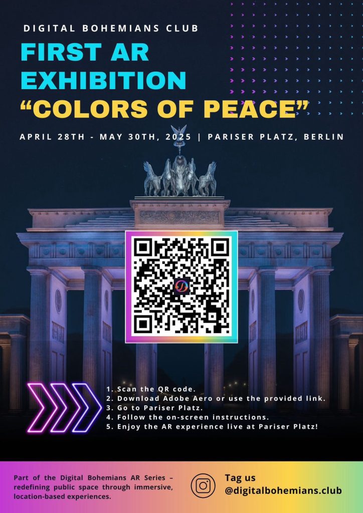
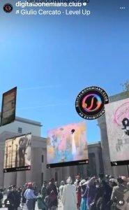
Berlin Art Lovers, get ready to witness history! The very first location-based AR exhibition, “Colors of Peace,” orchestrated by Digital Bohemians Club , is about to transform the iconic Pariser Platz in front of Brandenburg Gate!
From April 28th to May 30th, prepare to see my artwork, alongside the captivating creations of 12 other incredible artists magically spring to life through augmented reality. Imagine strolling through Pariser Platz and encountering stunning digital art installations floating in the air!
Let’s explore this groundbreaking AR experience together, wander through the digital exhibition, and connect over the powerful message behind it.
![]()
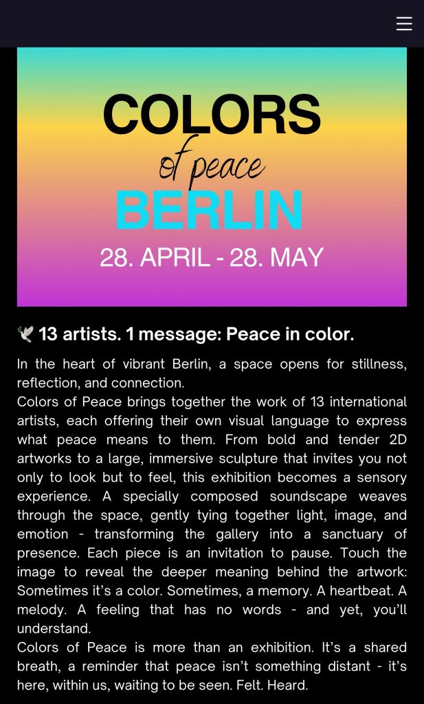
“Colors of Peace” unites the diverse voices of 13 international artists, each sharing their unique visual interpretation of peace. It’s one powerful message expressed in a vibrant spectrum of color.
Want to dive deeper? Discover more about this incredible project and the artists involved here: https://digitalbohemians.club/berlin
Don’t miss out on this revolutionary fusion of art and technology in the heart of Berlin! Download the Adobe Aero app before you go by scanning the QR code below, and get ready to be amazed!
If you are curious, my artwork is entitled “Ephemeral Serenity”.
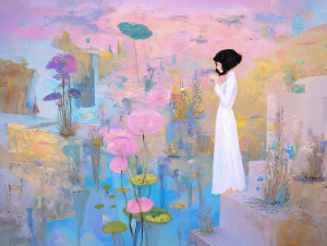
“Ephemeral Serenity” gracefully embodies the “Colors of Peace” theme by translating the abstract concept of inner peace into a tangible visual experience. The deliberate selection of soft blues, purples, gentle pinks, and creamy whites acts as a direct representation of the tranquility and harmony associated with peace.
Think of it this way:
Soft Blues and Purples: These colors often evoke feelings of calmness, spirituality, and introspection – essential elements of inner peace. In “Ephemeral Serenity,” they likely represent the quiet depths of the mind and the soothing nature of peaceful reflection.
Gentle Pinks: These hues can symbolize tenderness, compassion, and a gentle spirit, suggesting the emotional softness and kindness that underpin a state of peace.
Creamy Whites: Representing purity, clarity, and new beginnings, the creamy whites in your artwork might signify the uncluttered mind and the potential for serenity found in a peaceful state.
The seamless blending of these hues emphasizes the interconnectedness and fluidity of peace. It suggests that inner peace isn’t a static entity but a dynamic interplay of calming emotions and thoughts. The absence of harsh contrasts mirrors the lack of inner conflict and agitation that characterizes serenity. The muted tones contribute to an overall atmosphere of stillness, inviting viewers to slow down and connect with their own sense of calm.
“Ephemeral Serenity” conveys that peace isn’t a single, bold statement but a nuanced and delicate symphony of gentle energies working in harmony. Just as various soft colors blend to create a serene visual experience, inner peace arises from a harmonious integration of gentle emotions and a quiet mind. My artwork offers a visual meditation on the multifaceted and subtle nature of peace, making it a perfect fit for the “Colors of Peace” exhibition.